
Promoting reusability and artisanal craftsmanship


A chiselled icon with a humbling presence
After a number of iterations, we landed on a logotype comprised of a Penrose Triangle to represent reusability, with a chunky, 'wood chisel like' typeface for handmade charm. This black logotype was then paired with rich, natural timber shades to bring warmth. Finally, a timber grain brand element was introduced to elevate branded collateral further.

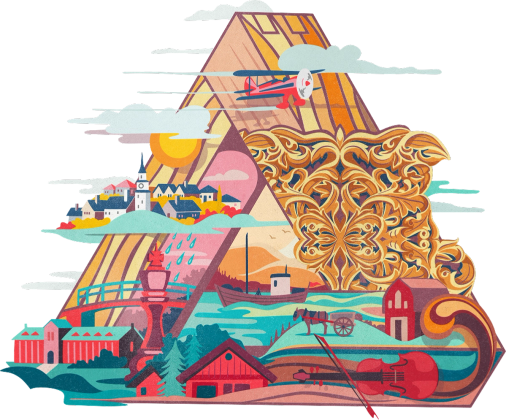
Romanticising the narrative
With a socially conscious cause grounding the company, we turned to illustration to romanticise the story and help colour the brand's story.


Simplifying a complex onboarding process

Conditional forms
When a user isn't logged in, the website appears as a marketing website to promote the brand. But when users opt to login, it becomes a content-rich marketplace to browse and post trees or timber.
To keep the process as simple as possible, we setup conditional forms that adapt depending on your selection.