You’re confident you have the best service or product on the market, you’ve invested heavily into branding and marketing, your website looks fantastic and perfectly captures the best of what you offer. Yet, your enquiry form is not generating enough leads. Or your subscribers list remains low. Or not enough of your customer are completing checkout. Or maybe your users are not signing up to your new service.
Does this resonate?
Whatever you set out to achieve with your website and whatever a ‘conversion’ means to you, we’ve put together this article to help you figure out why you’re not getting enough of them, and more importantly — how to fix it.
Let’s start at the beginning
To be successful, a website should do the following:
- Generate traffic — this means targeting the right buying personas with the right messaging through tools like search engine optimisation and external marketing campaigns. This gets the right people to your site in the first place.
- Drive engagement — once your users have arrived on your site, you need to capture their imagination and excite them enough to ‘drive action’.
- Convert — whether it be a sale, enquiry, or sign up. This is where call to actions come in.
All three of these objectives are equally important. But the last one, conversion, often gets overlooked despite arguably being the most important.
So, how do we rectify this? Let’s first understand exactly what a call to action (CTA) is:
What is a call to action (CTA)?
A call to action, in its simplest form, is an instruction or ‘nudge’ that prompts the user towards the action you want them to take.
Call to actions are found in all marketing material. In print this could look like a line encouraging readers to call a telephone number. But on the web, this normally takes the form of a button linking through to a contact form, or a button or banner with an instruction such as: ‘learn more’, ‘add to cart’, or ‘subscribe’.
There’s no denying that ‘call to action’ is a broad term that can be manifested in many different ways. But what is normally consistent across them (the good ones anyway), is they are easy to spot, clear and persuasive.

Apple Shop CTA
The anatomy of a call to action
(Good) CTA's are normally comprised of the following components:
Great copy
Most of the time, a strong call to action will begin with even stronger copy. Because no-one is being persuaded into buying, signing up or learning more by a button alone.
The copy that precedes the call to action should be clear and concise, free from jargon and perfectly pitched to the audience it’s aimed at. Whether the tone is funny, informative, no nonsense or shocking, it needs to ring true with the values and objectives of the site and it needs to feel authentic. Because it’s the best starting tool in your kit to get people to convert.
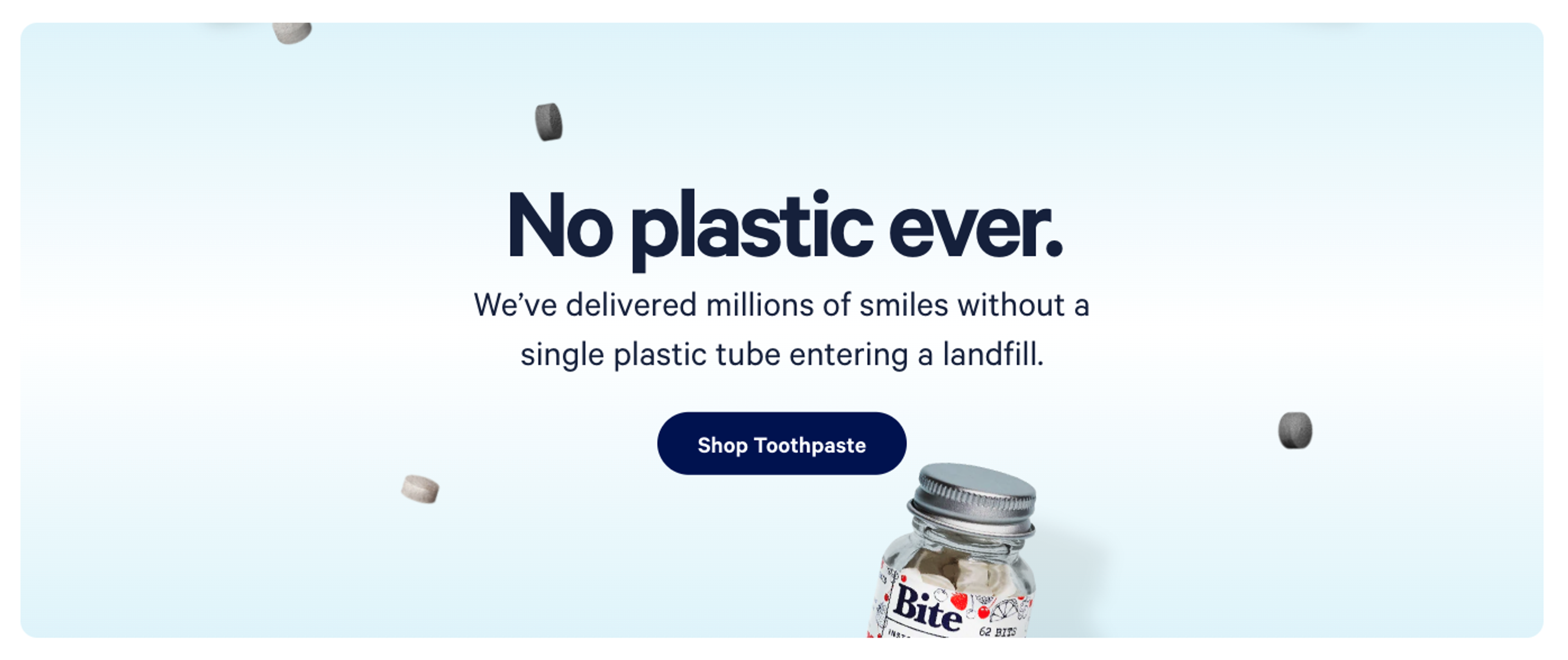
Bite Toothpaste bits, with bold type and a positive message
Visual stimulus
Great copy is important, but to really make it pop it needs to be beautifully wrapped in a visually engaging component such as a nicely designed container; displayed alongside an image or graphic; or simply, typeset in a bold, beautiful typeface (font).
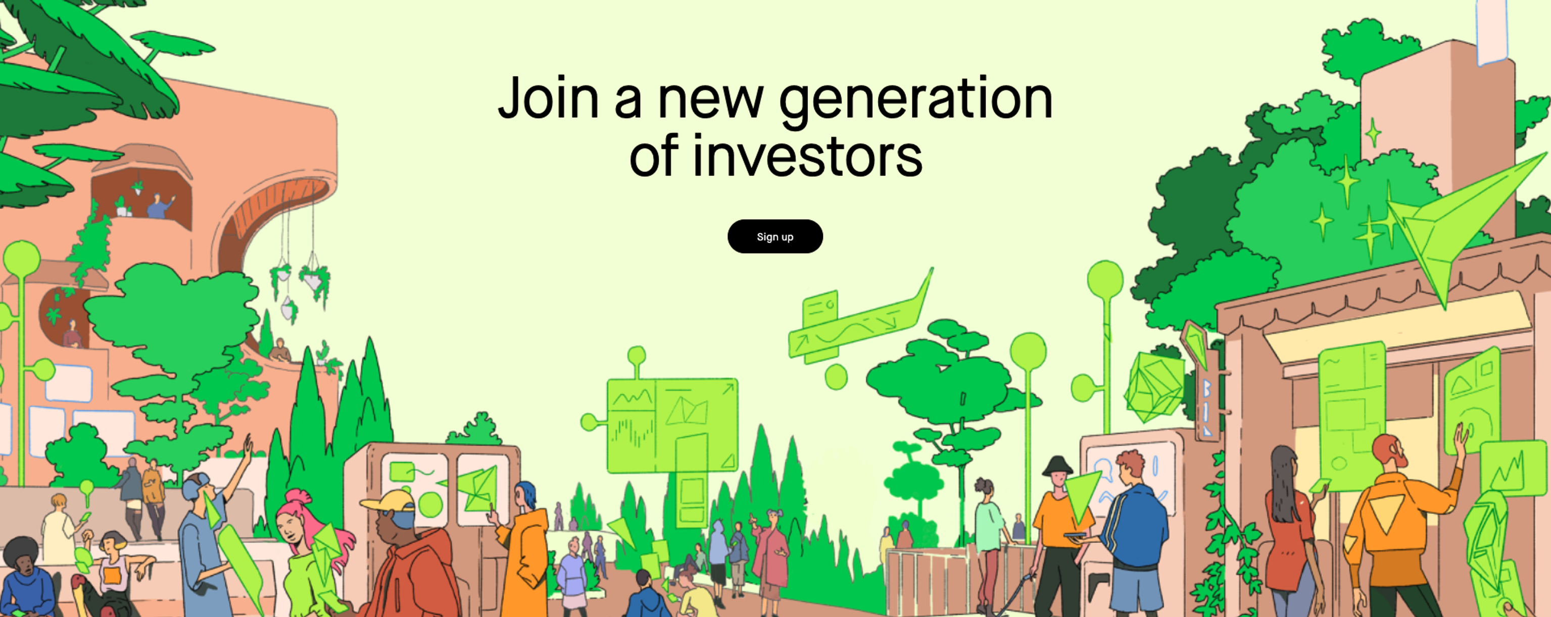
Striking colours and a strong illustration backs Robin Hoods CTA
Interaction
Once the user has noticed and engaged with the CTA, they must be able to take tangible action. On the web this is nearly always a link, input field or a button, but there are other less common formats too.
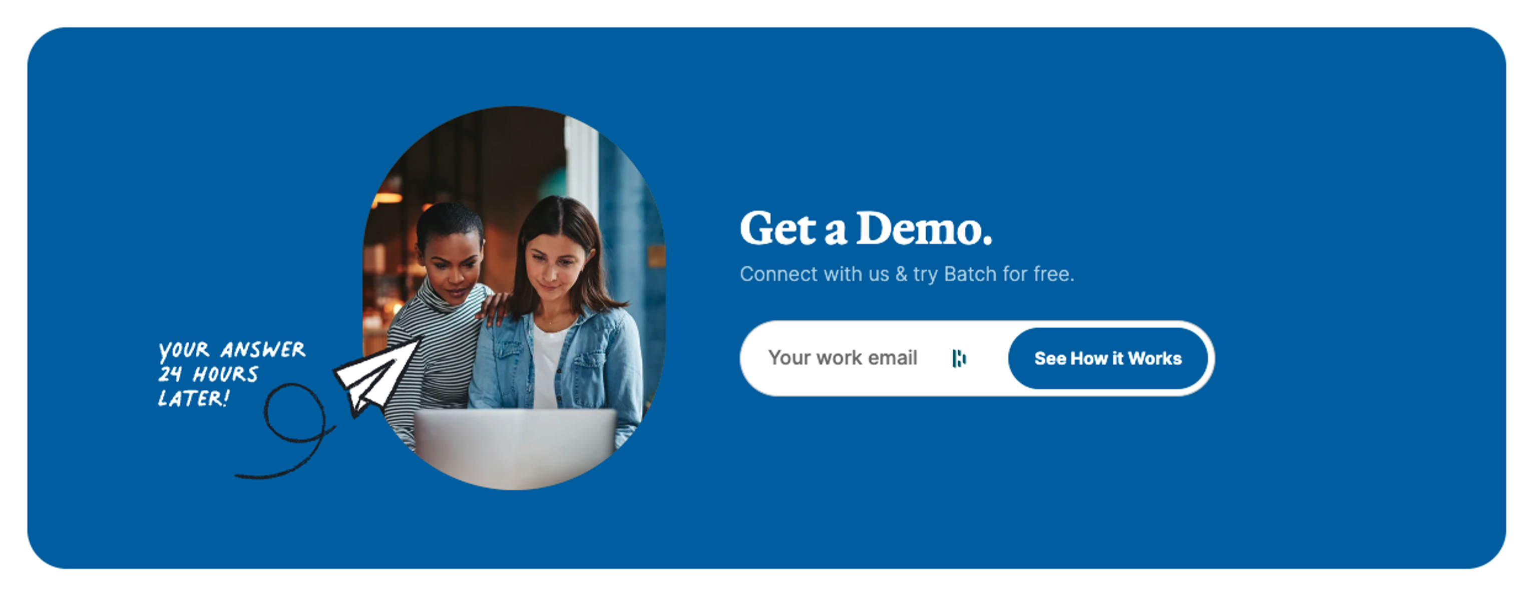
Batch CRM's CTA has an email input field as it's interaction
So now you have a good understanding of what a call to action actually is, let's look at some key principles for creating strong ones.
The principles of conversion
Creating the perfect call to action can take a wealth of experience, countless hours studying analytics, and thorough research into audience personas.
But thankfully this is experience we have, and from it we’ve pinpointed eight key principles that we adhere to every day:
1 - Placement
Timing is everything. If you present your CTA too early in a visitor's journey, when they’re not quite sold, you may lose them completely. Instead, you need to put yourself in the shoes of your users to determine where they might be ready to take the next step.

To do this, try and imagine you’re a car salesperson. You wouldn’t push a sales contract in front of a potential buyer before you’d given them the sales pitch, for fear of driving them away (no pun intended). In fact, quite the opposite — you’d first go to great lengths selling them the dream of a new car: how it would improve their daily life, that it’s equipped with the very latest technology and equipment to keep their family safe, or how it’s going to turn their daily commute into a pleasure rather than a pain, and all the other wonderful attributes that the potential buyer cannot possibly ignore.
And finally, when you’ve sensed the potential buyer’s body language has switched from scepticism to interest, you begin demonstrating how easy it is to lease or buy at such a low price. The final flourish being to hand over the contract and pen. That’s sales.
And on a website, it's exactly the same. You might not be able to read body language, but if you’ve done your research, you will understand your audience and will be able to estimate when the right time to attempt a conversion will be.
Here are some examples:
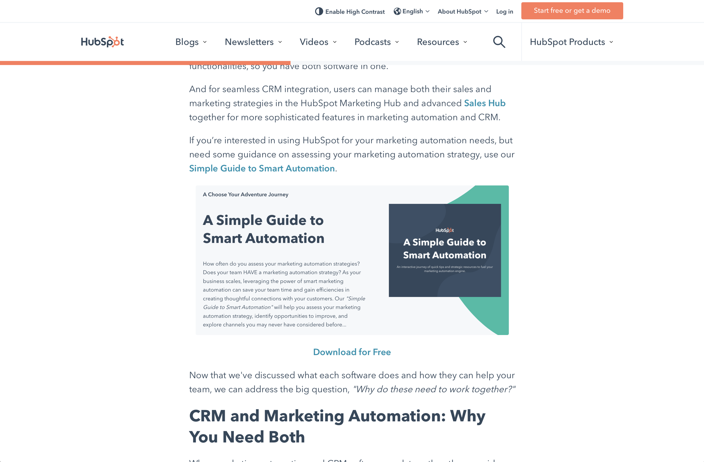
In this example, Hubspot have determined that if the user has read over half of this blog entry, they might be in a good position to sign up for a free related eBook. So they have created a pause in the article and nudged the user towards the resource with a call to action.
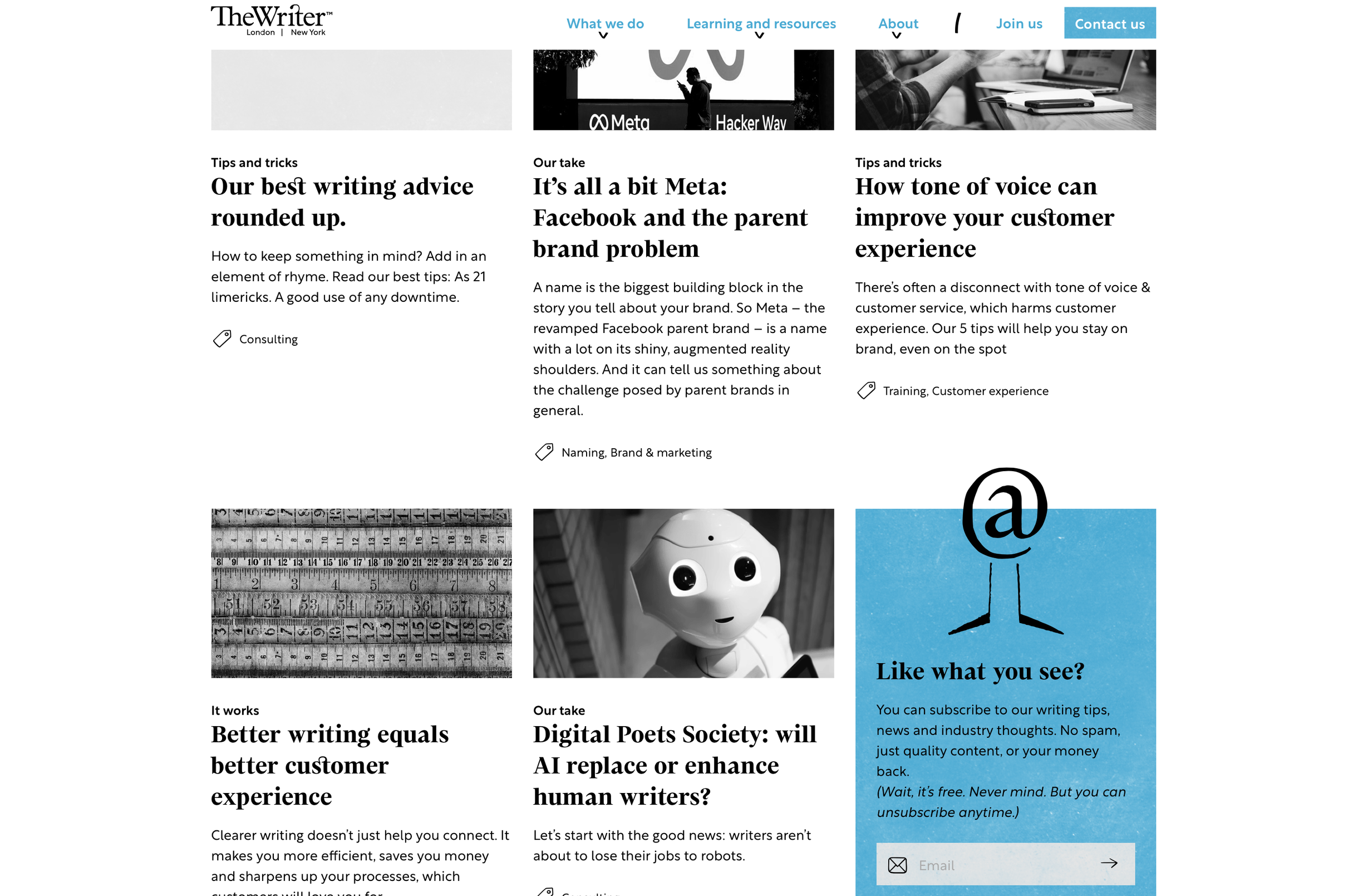
In this example, much like the previous, for our clients at The Writer, we determined that if a user is engaged enough to scroll down as far as they have through this blog listing, they may be interested enough to subscribe.

In this example, for Teoxane Treatments, we placed a subscribe popup that only reveals itself at the end of a bespoke beauty assessment questionnaire, but just before they get their results.
This means that we can be sure they’re engaged enough to have completed the questionnaire and are invested enough to wait for their bespoke results — a perfect moment to offer them the benefits of subscribing. Whereas if we had waited until after the results page, they may have dropped off and if we had asked them to subscribe at the start, it may have put them off doing the questionnaire at all.
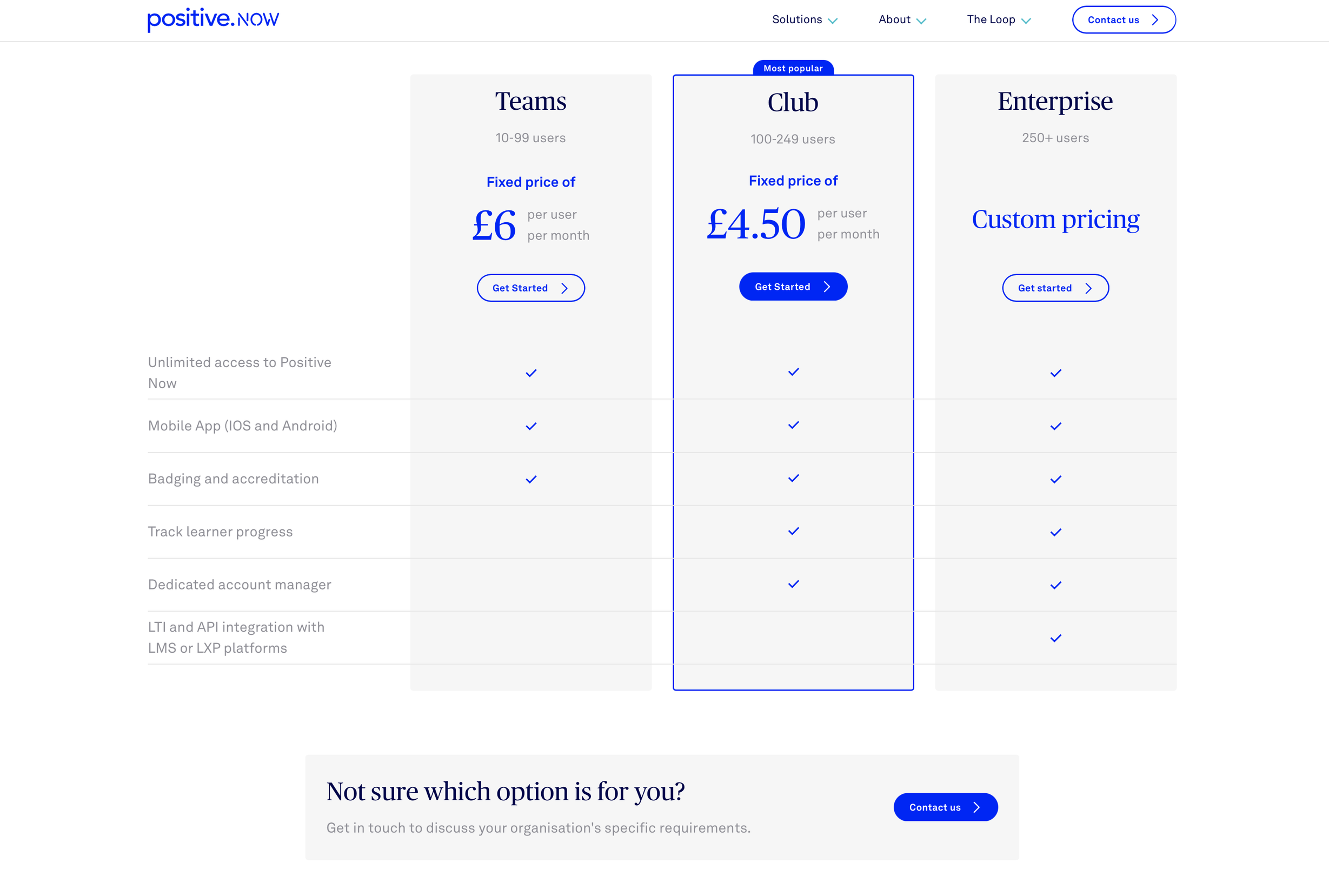
In this example, the CTA is placed just after we display a selection of price tiers and different solution options. We determined that if there was any chance the user was confused or not sure which option to take, a clear CTA to enquire might be just what it takes, in that moment, to prevent them dropping off.

In this example, the user will be reaching the bottom of a service landing page that's already presented the dream and provided a wealth of contextual information. So now it's time to start a conversation with a call to action to enquire.
2 - Context
Rather than dropping in a button that says ‘contact us’, it’s worth thinking about what specific services or products your visitor is mulling over at that time. Are they on a landing page tailored to their industry? Great – let’s create a call to action that addresses the industry and them directly. Have they been exploring a particular customer story? Fantastic — it’s likely they may have the same problems that that customer did before they became a buyer — so use that in your CTA and directly ask them if they’re looking for a solution for those problems.
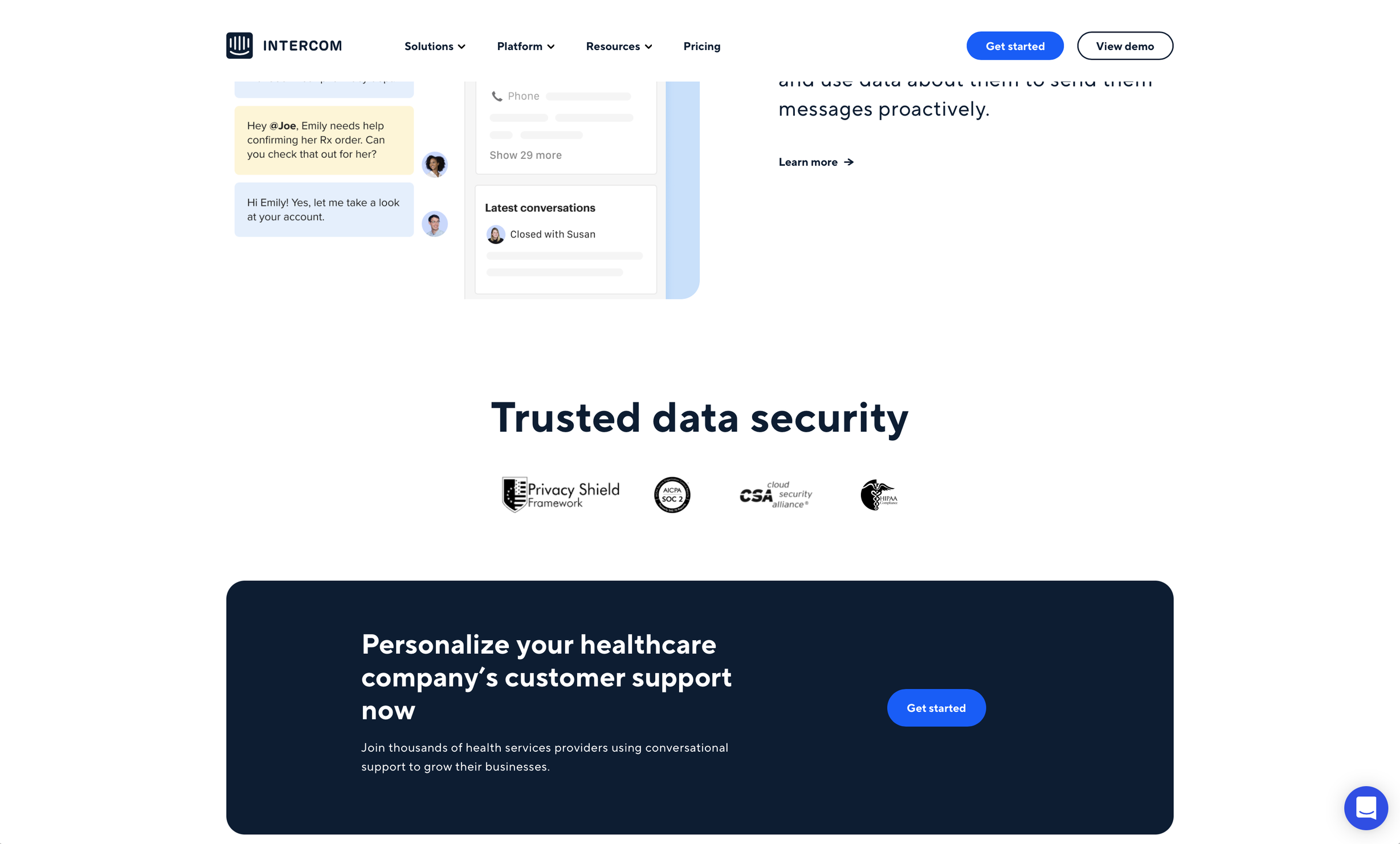
In this example, Intercom has personalised the call to action at bottom of each industry landing page, in this case, Healthcare.
3 - Hierarchy
Hick’s law, named after British and American psychologists William Edmund Hick and Ray Hyman, describes the time it takes for a person to make a decision as a result of the possible choices:
Increasing the number of choices will increase the decision time logarithmically.William Edmund Hick and Ray Hyman
Essentially, we need to be very careful not to overwhelm people with too many CTAs. To do this, we need to think about hierarchy and break up our actions into tiers:

Positive Group CTA Button Hierarchy
Primary
The primary action is the main purpose of your website. Is it directing people to the contact form? Is it making a sale? Is it getting them to sign up? Whatever it is, there should only be one primary action.
Once you’ve determined what it is, you should then design it so that it’s the most prominent CTA on your site. It can be repeated as many times as you need, but it must still be directing people to the same primary action.

With NetSpring, their primary call to actions are clearly the most prominent on the page and they always direct to the registration action.
Secondary
Secondary actions are still often a lead conversion tactic and will be directly related to the task at hand, but perhaps more relevant for those not quite committed enough to the primary action. For example the primary action could be a purchase act, but the secondary action might be a ‘talk to an advisor’ button.
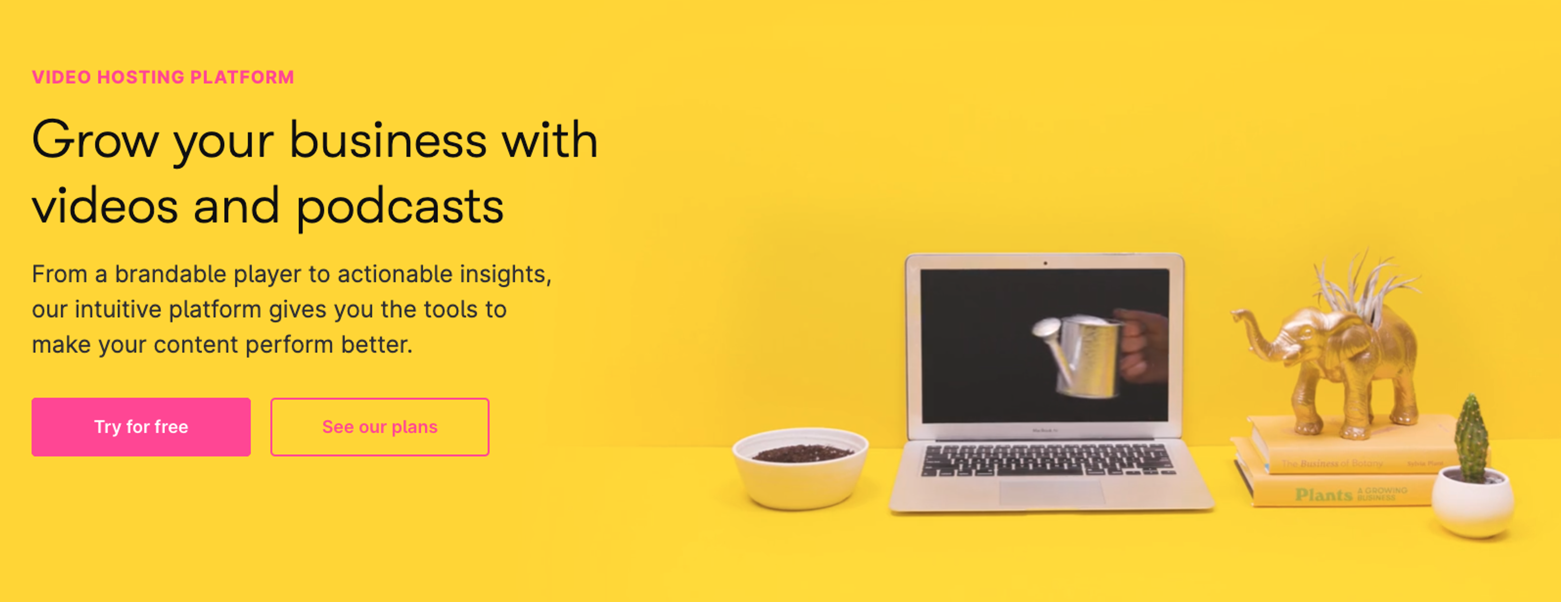
Wistia has backed up its primary button with a secondary action, leading the user to explore their pricing tiers. This is for those not quite ready to commit.
Tertiary
A tertiary action is often a link allowing the user to learn more or further explore the topic at hand.
This will take the user away from the page they are on, so you need to be careful not to make them too obvious as you always want the primary and secondary actions to be most prominent.

Trading View have used tertiary CTA links to lead users to explore more about the company and their product. But these actions do not have the weight of one used to actually become a Trading View customer.
4 - Value vs. commitment
It’s essential that the value the user will get out of engaging with the CTA is not overshadowed by the level of commitment expected of them to proceed.
It is therefore important that you demonstrate this balance:
Value must be abundantly clear to the user. Why should they commit? What will they gain from following this call to action? Why now?
What is the commitment? Are they giving away their data? Then make it clear you’ll treat their data with respect. Will they be bombarded with spam? If not, make this obvious. Are they making a purchase? Then make it evident how affordable it is.

SortList reduce commitment with a label indicating that it is free
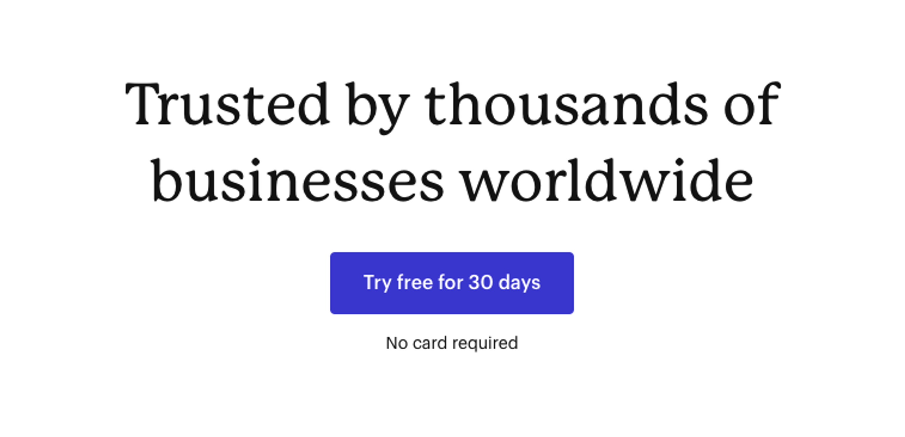
Capsule demonstrate a no commitment signup with no credit card required

SyngSpace demonstrate how confident they are in their product by offering full refunds
5 - Urgency
This is not always applicable, but it can be a useful tool in your conversion toolkit.
Instilling urgency in your visitors is the concept of giving the user a time limit or a strong reason to commit now. This can be in the form of a temporary sale, limited availability, or some other deadline for action.

Booking.com are the kings of urgency + value + commitment. They show in real-time how few rooms remain at the property, thus instilling a sense of urgency in the visitor to complete the booking. And, what's more, they enhance the desirability and impetus to act by removing commitment — the user can cancel at any time.
6 - Safety net
Not all of your visitors will engage with your CTAs. And that's okay, it’s even to be expected, but unless you give them somewhere else to go, you run the risk of them dropping off entirely.
That's where the safety net comes in. A safety net exists in the form of secondary or tertiary action(s) that allow users who are not quite ready to commit the chance to further engage until they are.

Stripe has added a safety net of multiple tertiary links, close to their primary CTA. This urges un-committed users to continue exploring until they are ready to sign up.

The footer is one of the best safety nets a website has. It sits at the bottom of every page, and, if designed well, presents those who may not have found a suitable ‘next step’, with a smorgasbord of enticing sections, features or services to explore.
So, no more thinking of the footer as an afterthought.
7 - Reiterate
As we’ve already discussed, your visitor may not be ready to commit to your primary action just yet. But that doesn’t mean they won’t be after they continue browsing a little more.
So it's important we continue to repeat CTAs throughout the user experience in the hope that at some point in their journey, one of them might just be the one that was at the right place at the right time to convert them.
Returning to our salesperson analogy, this is the equivalent of a well written follow up email or phone call.
8 - Test
Once your website is launched, the work doesn't stop there. In fact, this is when the real challenge begins.
With granular analytics, you should be testing the performance of every CTA on your site. You should know what's going well and what's not. For CTAs that aren’t performing, it’s time to go back to the drawing board and look at other options. And even for the ones that are doing well, it’s still a good idea to explore the potential for improvement.
To do this, we follow a process called ‘conversion rate optimisation (CRO)’, and it works like this:
- Analyse the data and create a hypothesis as to what might be causing users to drop off or miss CTAs.
- By using multi-variant testing (where your users are split into groups and each see slight variations in your site), test potential improvements against the existing design.
- Analyse the results and determine if further changes are needed, or whether the new solution can be committed to all of your audience.
- Repeat this process — you should be always improving and optimising indefinitely.
Conclusion
As we’ve seen, ‘call to action’ is a broad term for an abundant way to generate leads.
In this article we’ve touched on the most common scenarios, but there is so much more to explore.
We’re now seeing so many more ways users can interact with the web, from voice commands to augmented reality, and that includes how they can be converted. But whatever the medium, the principles remain the same – just as they have remained the same since door-to-door sales.