Introduction
The beauty of the internet is the sheer variety of people who might stumble upon your site in search of information. Be it a CEO with seconds to spare, or someone with time to compare and contrast your offering to that of your competitors —how do you cater for everyone’s needs, without compromising?
Start with skimmable sub-headings

Get the most pertinent point across in the heading and you stand a chance of capturing the attention of even the most distracted of customers.
You can do this through clever copy, but you can also achieve it through structural changes like breaking up wording into headings, subheadings and bite size chunks, which allows high level content to be accessed and ingested quickly.
The time poor visitor will likely only catch the first few words of each sentence, so ensure you get straight to the point and that your headings contain the key words and core detail. Then, allow the text beneath to elaborate to the level of detail you want to get across.
Say it smarter, better, faster
Once you’ve got the structure in place to facilitate readers of all levels of interest, you can work on streamlining your copy so every word packs a punch.
A good tip is to re-read each paragraph looking for unnecessary words, idioms and phrases that elongate your sentences and could eventually lead to reader fatigue. That doesn’t mean stripping away important details, it just means using the fewest number of words to get the same points across.
Another way to make your copy work harder is to check you haven’t used unnecessary jargon or over-complicated your sentences by choosing complex words that may alienate people or cause them to switch off.
After all, why would you write that someone can find your office ‘situated down a charming side-street off one of the busiest roads in London’ when you could just tell them your address?
Layer your message
It can be tempting to upload all the information and ideas you want to share in one place. But this assumes a level of engagement, excitement and understanding akin to your own, which unfortunately isn’t always the case.
The best way to bring people along with you is to build on the message in layers, enticing people with the information that’s most compelling or easiest to understand, before expanding on it as the narrative progresses.
Taking the time to do this creates a richer and more interesting user experience, and will help keep people exactly where you want them — on the page.
Formatting and interface
The interface of your site can also be adapted to help you land your point.
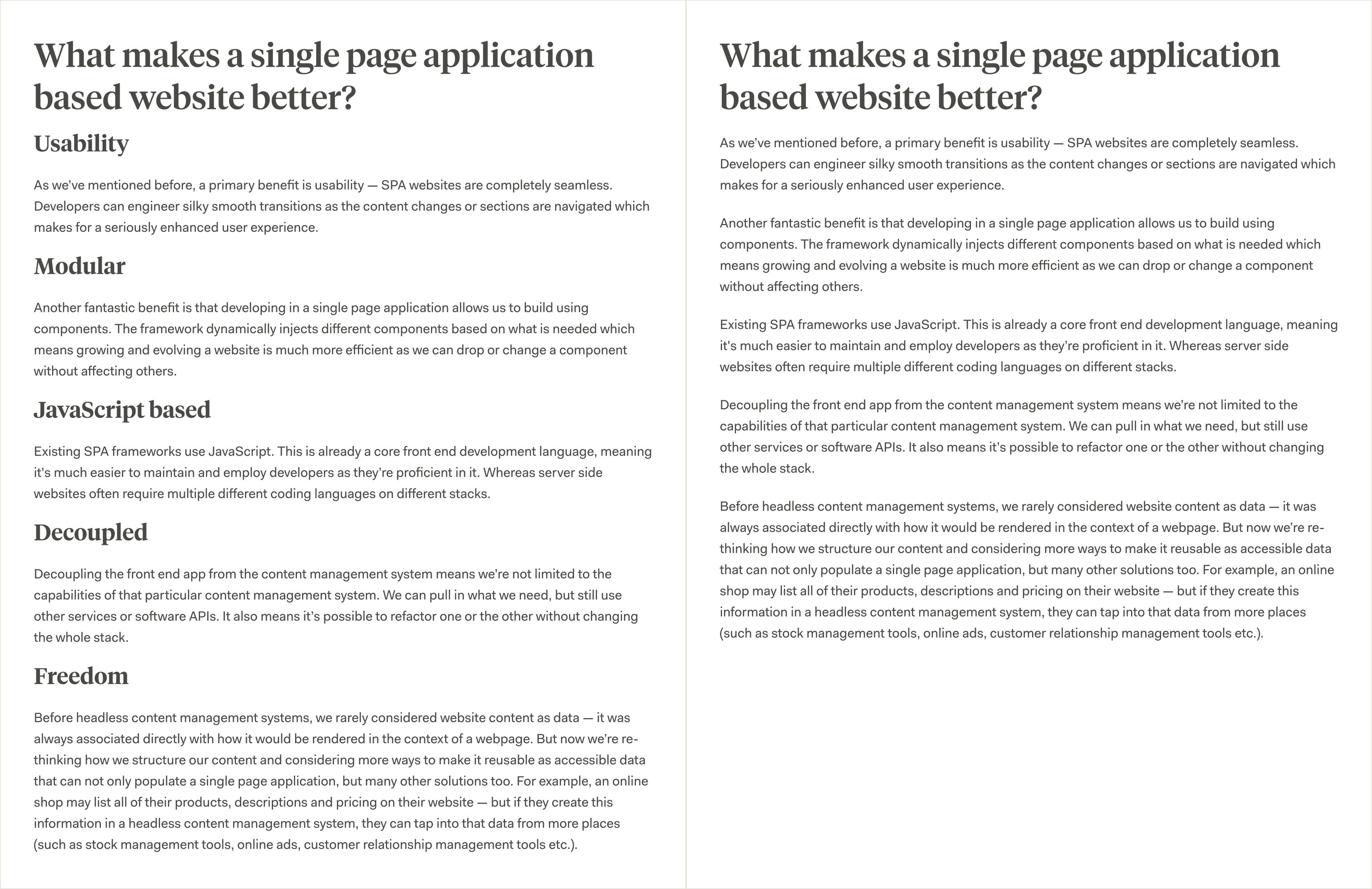
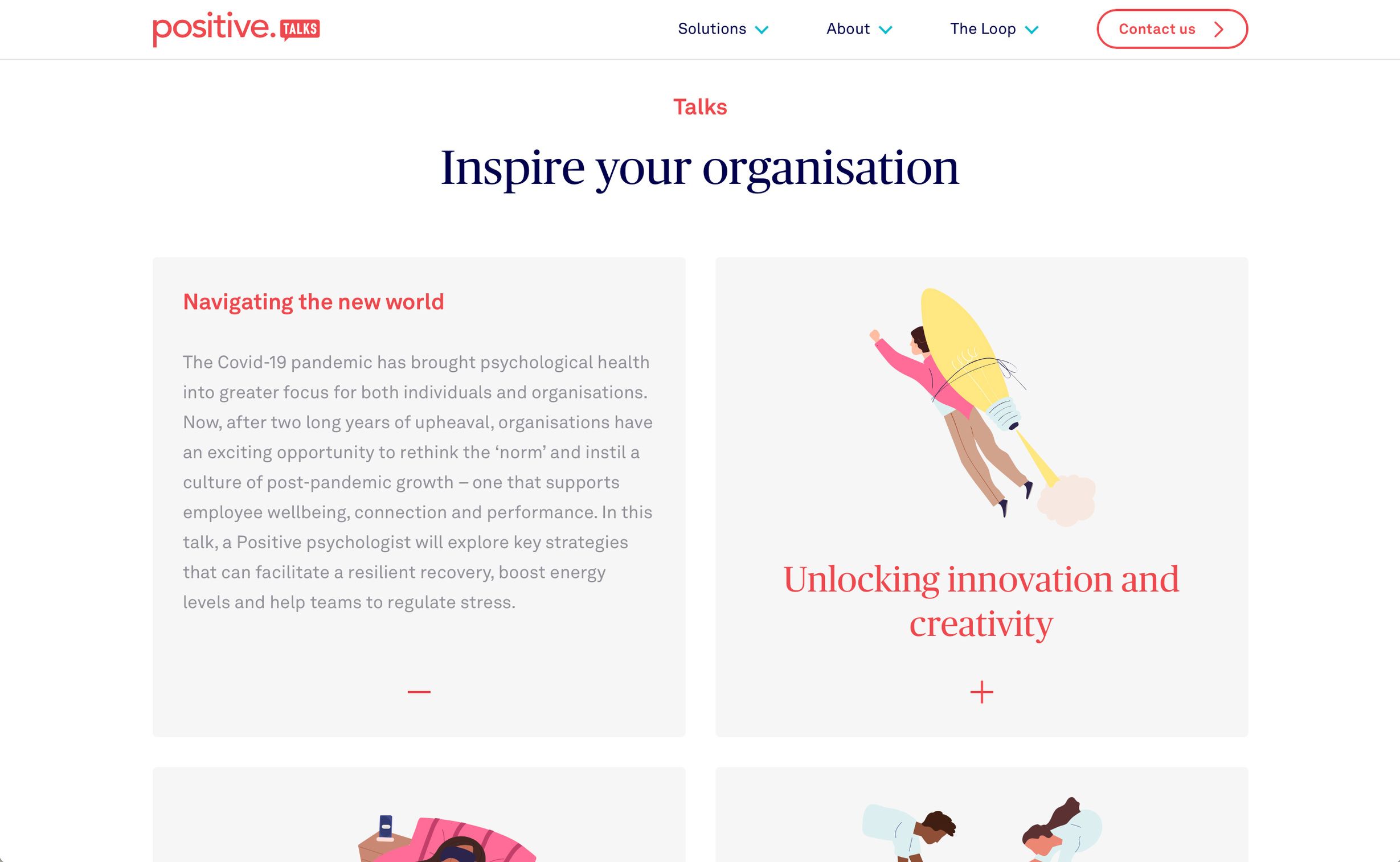
Using interactive, expandable components like accordions can really help keep content simple and manageable, while also providing more information as and when it’s needed.
A few examples of these components are:
Accordions

Accordions have been a staple part of smart web design for years — allowing readers to hide or reveal information, depending on their level of engagement. They even have HTML syntax so they can be created without any styling.
Tooltips
Tooltips are best used when you want to provide hints or extra snippets of information relating to a word or short phrase. Tooltips are not ideal for mobile users, so bear this in mind when considering them.
Hoverable cards

Hoverable cards can be used to create a playful experience that enables the user to get additional information while browsing, without being distracted from the content they’re interacting with. But again, keep in mind that hover cards aren’t ideal for mobile users.
Modal windows

Modal windows are often used for alerts, but could also provide more lengthy content at the user’s request without taking them to another page and interrupting their browsing experience.
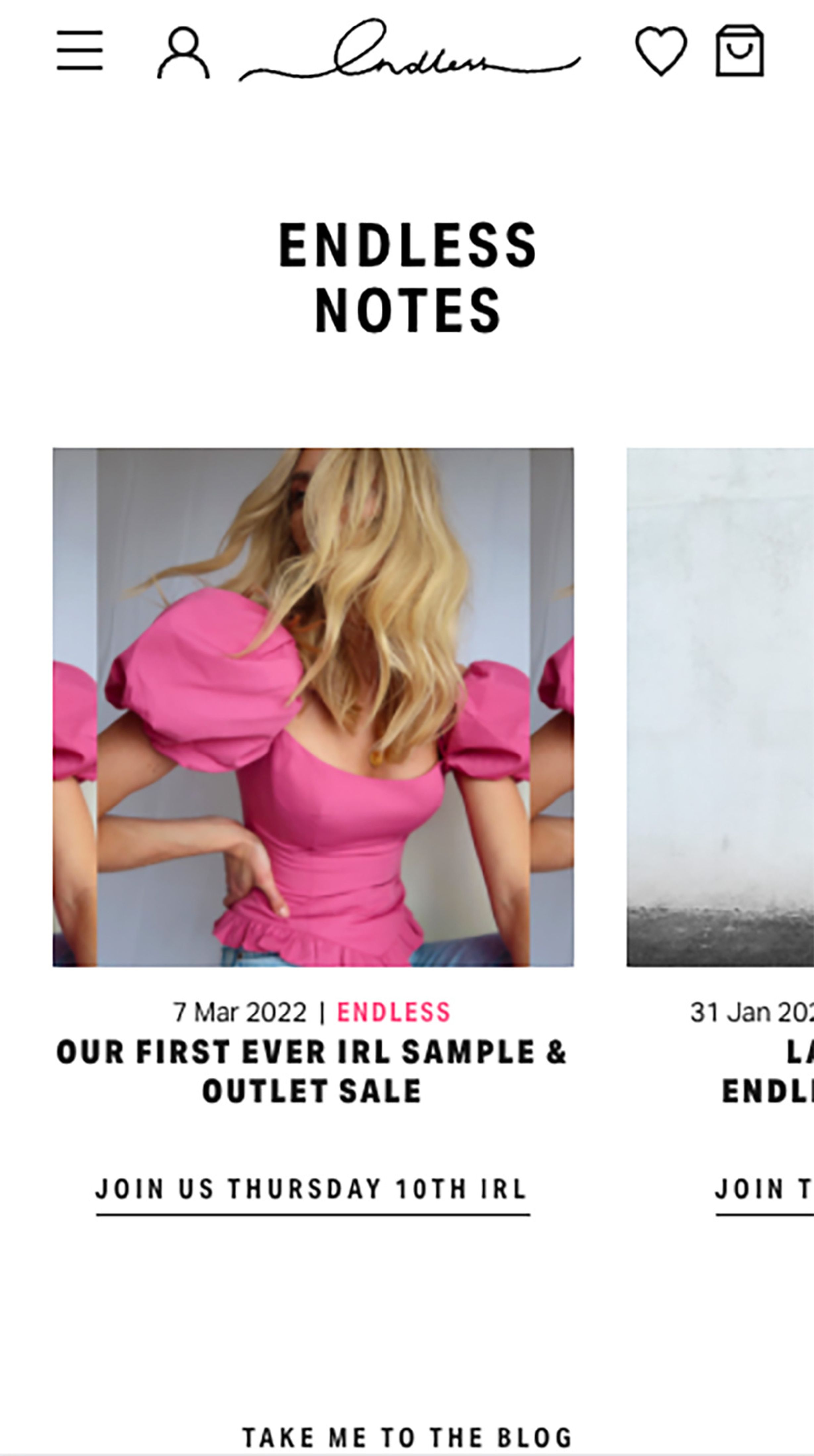
Horizontal overflow

Horizontal overflow can be used to prevent long pages. Rather than stacking articles or features vertically and forcing the user to scroll past them, horizontal overflow gives them the option to skip or explore. We recommend only using this for content the user will clearly know is relevant to them.
Less is more when it comes to landing pages

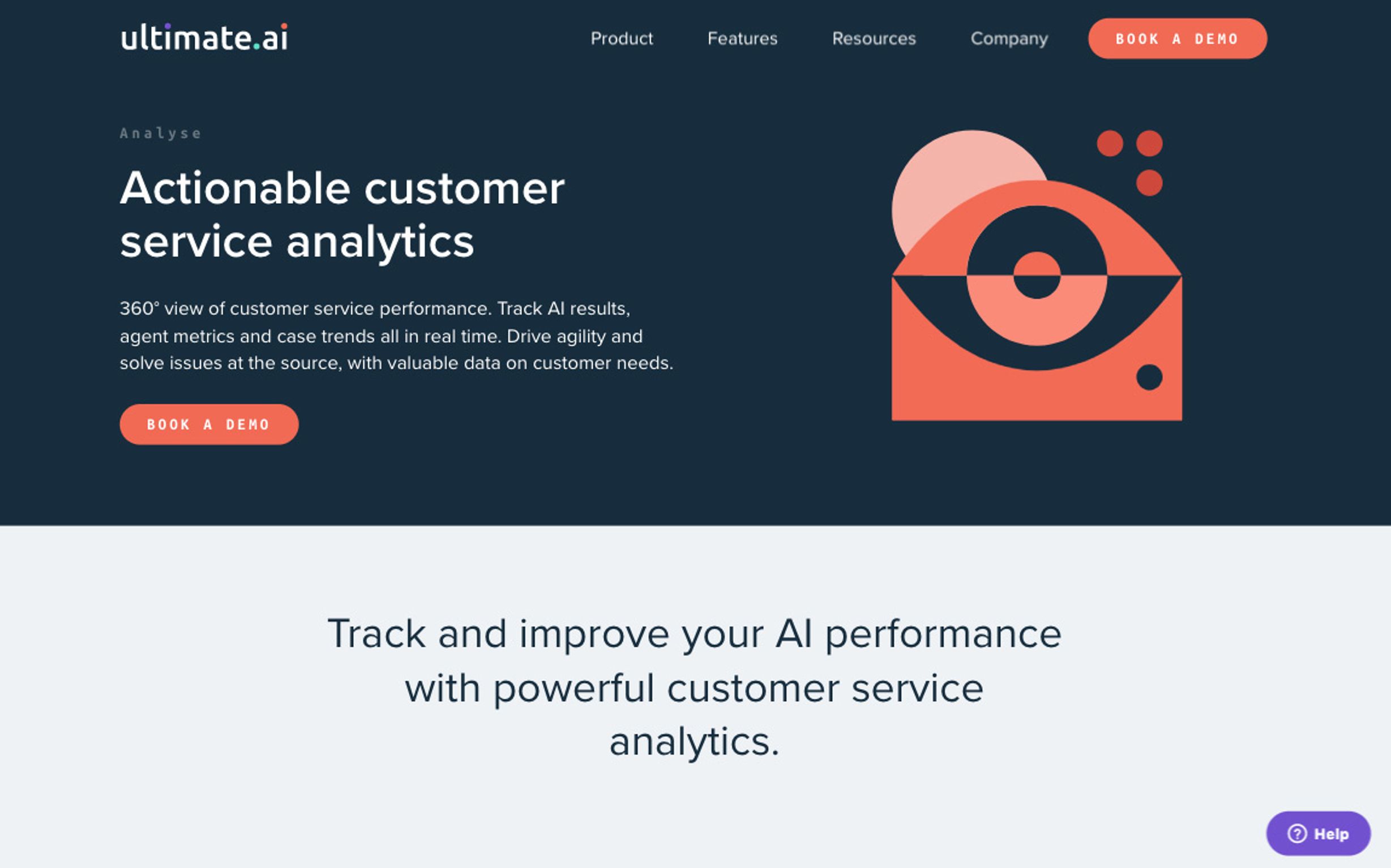
We kept things simple and straight to the point, for ultimate.ai's landing pages
Your landing page is nearly always the first port of call for new users who may have come from social media, search engines or other external sources. Which means it’s best to assume that the majority of people arriving on the landing page will require nothing more than topline detail to decide whether they want to know more. Plus, it’s good practice to ensure your landing page is highly skimmable.
Each snippet should aim to engage and excite, and can be followed up by a button or call to action encouraging the user to delve into the detail.
Break things up with impactful imagery

For Positive Group's solution landing pages, we used illustration to compliment the narrative
Nothing says fast bounce rate quite like a website chock-full of text and lacking in visual stimulation — whatever the subject matter.
Images keep your visitors on the page for longer. So combining concise copy with captivating visuals (be it infographics, photography or illustrations) is one of the most effective ways you can hook your readers in for longer.
So there you have it. A few simple tweaks that could drastically increase your website’s user experience and reduce the bounce rate on your pages.