Introduction
Internet Explorer was discontinued in 2013. Which may feel like yesterday, but at the time of writing this article is eight years ago. Nearly a decade. So you can imagine our frustration (hey, we're creatives after all!) that we're regularly asked to support the archaic browser, for the select few who still use it.
Internet Explorer was discontinued before the full adoption of some of the most important features of the modern web, so supporting it requires adding in fallbacks that often result in bloated code and a slow and tedious development process.
But it's not just Internet Explorer we're taking (polite) umbrage with. Even old versions of current browsers like Chrome, Safari and Firefox can pose issues.
So this year, we decided to stand by our commitment to purposeful web design by no longer supporting browser versions that don't have the following key development technologies:
Flexbox

Flexbox was introduced in 2009 but wasn't fully adopted by modern browsers until roughly 2017. Flexbox helps developers position elements within a container to allow for more flexibility and control. It is, in my opinion, one of the most important CSS updates from the past two decades. Before Flexbox, American developers had to hack positioning elements like columns and rows by using display float, which was not fit for purpose.
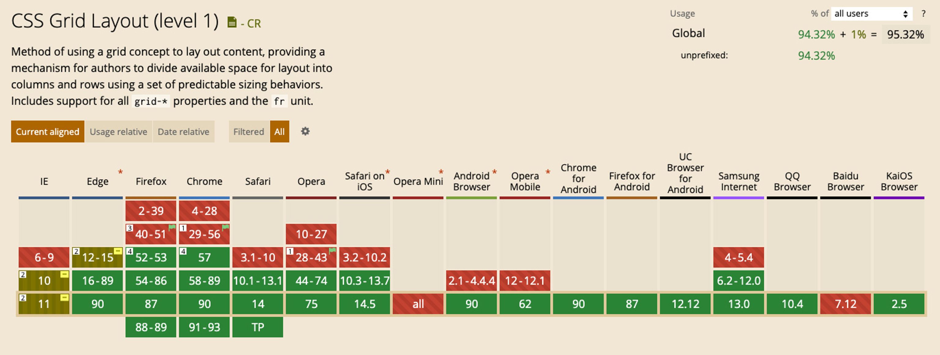
CSS Grid

CSS Grid might not be as essential as Flexbox, but it is still an incredibly useful tool for creating complex grid layouts. At Function & Form, we often use it to display a patchwork of images or a gallery. Without it, creating layouts can be arduous so it's quickly become an important part of our toolbox. CSS Grid was first announced as early as 2007, but was not widely adopted until 2017.
CSS custom properties*
*(AKA css variables)

CSS custom properties was a welcome addition to CSS. It allows users to create interchangeable variables for elements including colour and fonts. These can then be changed dynamically — perfect for theming templates with different colour ways or styles. You'll see it used a lot to create recognisable styling tools like 'dark mode'.

What does this mean for you?
To improve both the user and client experience, we now add a notice to any websites we create recommending users upgrade their browser if it doesn't support the above technologies.
The internet is progressing and changing faster than ever before, and with more browsers switching to Chromium under the hood, including Edge, soon browser support will become much more consistent and the adoption of new features much faster. And we couldn't be more for it.
Here's to a better, more powerful web...